If you have Spotify, you’ve probably guessed that all of your data—every song you play on repeat, every podcast you keep up with, every artist you religiously follow, every single playlist you love—is saved and stored. From this data, Spotify’s crafty algorithm is able to suggest new content for you based on what you have loved so far, especially if you have clicked on the heart button under a song, album, or artist. And this algorithm goes much farther than this: Spotify tracks your listening habits according to how long in a given period of time you are using the service and what time of day you are most using the app. This explains why you might see certain playlists pop up at precise moments in the day or year like the Daily Drive playlist made for one’s trek to work or school appearing in the morning, or Your Summer Rewind playlist to remind you of what you listened to the summer before the one you might be in, or even the Pumped Pop playlist appearing at a time when you are usually working out. Then again, these could all just be instances that have happened to me.
To acquire all of the data I needed, I requested it through Spotify through my Privacy Settings, which anyone can do if they want to see an in-depth analysis of their listening habits. I followed these steps to help visualize all of my data, which gave me several different visuals to analyze my listening habits.

So, the first visualization I received was the overview above. It does not really show more than what we can see. Since I’ve only had Spotify for a year this March, all of the numbers from this and the rest of the visuals are from 2020 to 2021 as of last week. What this visualization tells me is that I’ve listened to almost 35,000 songs in one year and I spend almost 23% of the day listening to music. After this visualization, I was able to create a few more that dived into which artists I listen to most and what my most played songs are.
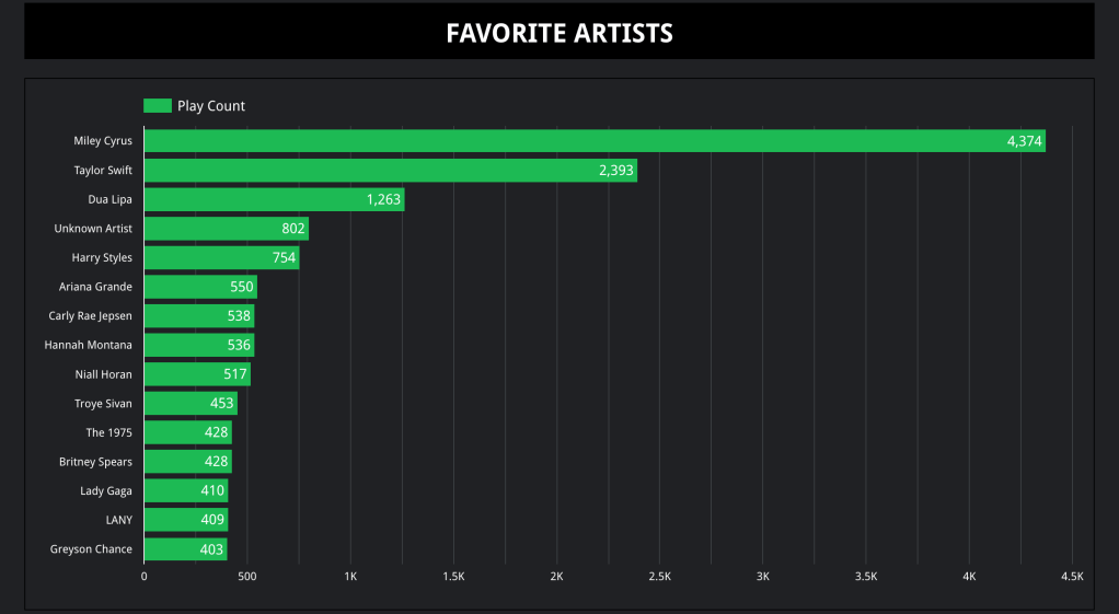
The next visualization I received was my Favorite Artists. What this data shows is how many songs I’ve streamed from each artist. Unsurprisingly, Miley Cyrus is my top artist (as she has been every year) and she almost doubles Taylor Swift’s plays, the next most-listened to artist here. If we eliminate whoever “Unknown Artist” is supposed to be (though if I had to guess, it is most likely the unofficial released songs of Miley Cyrus), then we can conclude that I listen to mostly female artists, but the disparity is not that great with 8 out of 14 versus 6 out of 14. But if we total the amount of plays by gender, I predominately listen to music made by female artists (as it should be). Next, we’ll move on to my most played songs.
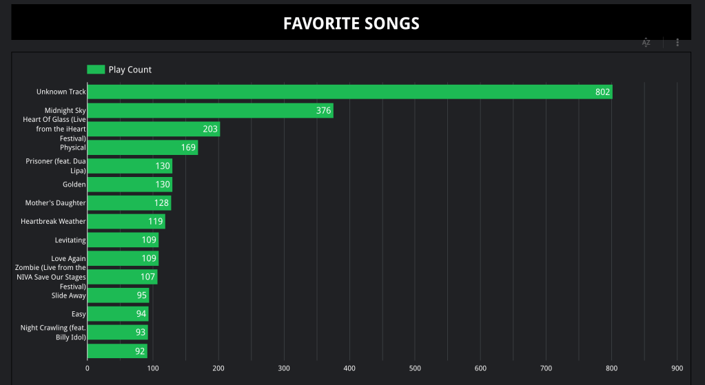
We’re going to ignore “Unknown Track” like we ignored “Unknown Artist” for this analysis. Unsurprisingly again, Miley Cyrus dominates my most-listened to songs list with half of the entries shown. In my defense, she released a new album this past year. Dua Lipa is the only other artist to have more than one entry in this visualization (“Physical”, “Levitating”, and “Love Again”), but what is more interesting is that the rest of the entries are songs by male artists. Also, if you remember from my second visualization, Taylor Swift was my second most-listened to artist, but none of her songs appear in the top fourteen most-listened to songs of this whole year. What is not shown in the data is that Taylor Swift’s catalogue is far bigger (nine albums) than Dua Lipa’s (two albums), which might explain why she has more overall plays, but not as many plays for specific songs. Moving on from this data set, we’ll see days that saw me using Spotify a lot.
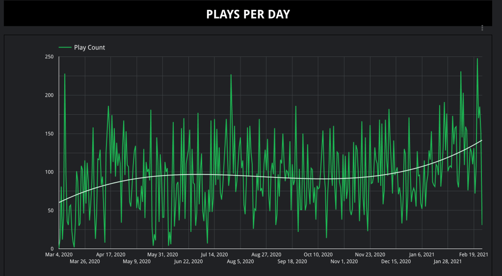
This visualization might be the best way to guess where I was and what I was doing on a particular day, especially where there are spikes and dips. From the beginning, between March 4th and March 26th, we can guess that I did not use Spotify that much when the pandemic first struck. This period sees the lowest amount of plays per day overall. Between July 14th and August 27th, we see the amount of plays per day steadily increasing, so much so that the plays per day never get as low as the former date. Instead, there is a general uptick, which could be explained by the summer break. Lastly, from January 6th to February 19th, we see the plays per day finally reaching their greatest peak since I first started using Spotify. This can definitely be explained by my having an internship where I spend sixteen hours a week reading manuscripts and having Spotify on as background noise. The final visualization depicts the variety of languages of the music I’ve listened to in the past year.
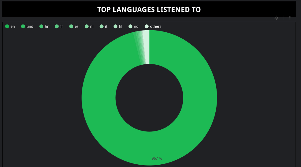
From this data, one could safely assume that I am an English-speaker, and if one dug deeper, they might assume I am an American since less than 4% of my music comes from other languages. This could be a drastic assumption to make, but based on only 20% of the American population being multilingual versus Europe (56%) and India (26%), it would not be totally incorrect, but would be harder to prove with the data given. You might be wondering how I’m able to analyze the languages I listen to, and it was only possible because I ran a formula in the data set that analyzed each song’s language based on its title.
There are a lot of ways to visualize your listening habits on Spotify. You can make graphs comparing how much you listen to your favorite artists and how many times you actually listen to your favorite songs. Or, you can even map out your listening habits over a period of days and see when you listened to music a lot compared to when you did not. But these visualizations are not the only ways to creatively visualize Spotify data. The beauty of Spotify is that a lot of people, like those obsessed with their listening habit trends and data visualizations, have made websites that quickly analyze your entire profile and will give you visualizations for “Most Recent”, Last 6 Months”, and “All Time” usually. Here are two examples:
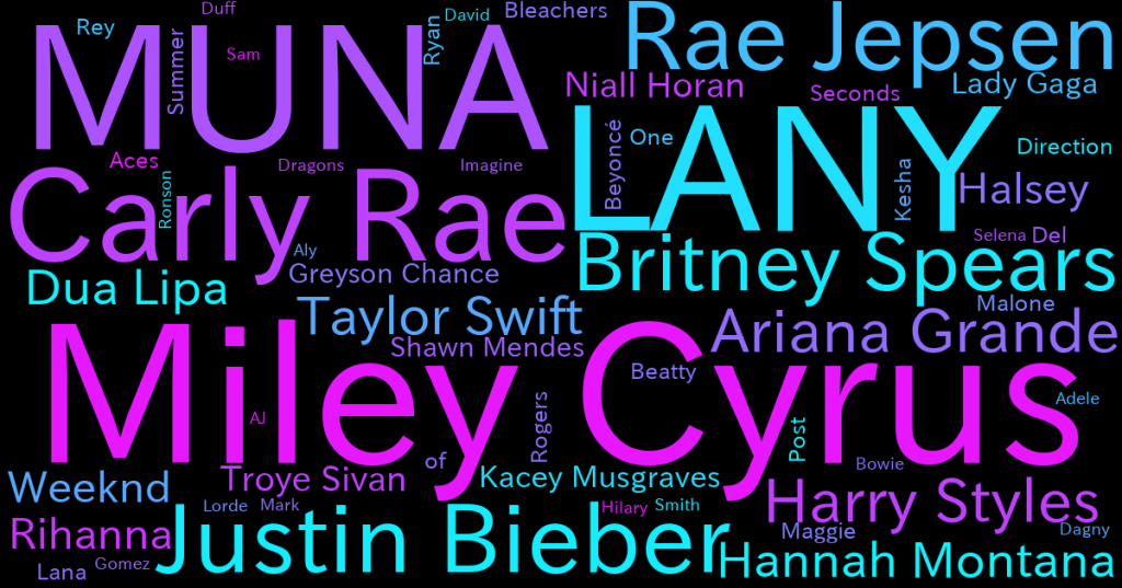
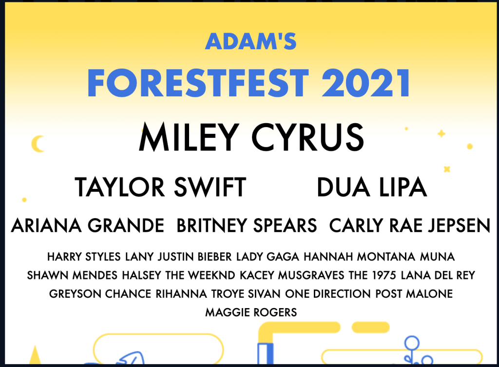
So, besides the in-depth visualizations I have shown here that provide numbers and trends, you could just get a word cloud or music festival lineup made from your listening habits. These are a lot of fun to share with friends or on social media if you’re wanting to brag about your music taste. Besides these, Spotify provides a visualization of your listening data every year called Spotify Wrapped. There is also Stats for Spotify and Last.fm which both constantly record your Spotify data as you are using it.
In the twenty-first century, music is straying further and further from how it used to exist solely as a physical form in the shape of an LP, CD, or single digital file because as streaming services grow more in popularity, music will be used more for data purposes. These purposes are being used today to review how the English language is losing its dominance or being used by marketers to target specific products and experiences tailored around your music tastes. Unlike decades before, music will literally become a part of who we are in digital spaces because of how entrenched we are in streaming data.
If you’ve had Spotify for five or more years, I encourage you to try this exercise out because you will definitely have more to work with than I did.
